
One of the things I love about designing for print is that the experience isn’t limited to what someone sees. The weight of the paper, the texture of a finish, the way something reflects light, and even the way it feels in someone’s hand can all become part of the design.
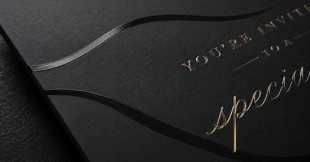
I once worked on invitations for an annual educational event where the goal was to create something that felt more like a wedding invitation than a piece of marketing mail. The design itself established the look, but the production choices helped sell the experience. We used a heavy card stock and metallic printing to give the invitation a sense of importance and luxury. Before someone even read the details, the weight and finish told them this wasn’t another piece of junk mail.
The exact same design printed on lightweight, glossy card stock wouldn’t have had the same impact.
On another project, I designed booklets for a Cancer Care program. This time, the goal wasn’t simply to make the piece feel expensive. We chose a soft-touch finish that gave the booklet a gentle, almost velvety feel. The tactile experience complemented a program centered around care, comfort, and supporting people going through cancer treatment. The finish wasn’t just an embellishment. It helped reinforce what the piece was communicating.
Even my own business cards use finish as part of the design. They’re soft touch with color-on-color spot UV, so portions of the design shift from matte to gloss as the card catches the light. It’s subtle, but that’s the point. The contrast adds another layer to an otherwise simple design without overwhelming it.
There are countless ways to elevate a printed piece. Foil, embossing, debossing, letterpress, die cuts, metallic inks, spot UV, specialty stocks, and coatings can all completely change the experience of a design. But that doesn’t mean adding more finishes makes something better. The production choices should make sense for the piece.
A luxury invitation and a Cancer Care booklet shouldn’t necessarily feel the same just because both are intended to feel elevated. One might call for weight and shimmer, while the other benefits from softness and restraint. Choosing a finish is another design decision, and it should support the same objectives as the typography, color, imagery, and layout.
That’s what makes print so interesting to me. On screen, we design what someone sees and how they interact with it. With print, we can also design what they physically experience.
Sometimes the smallest production detail can completely change how a piece is perceived. The paper, weight, texture, and finish aren’t simply what the design is printed on. They’re part of the design itself.