
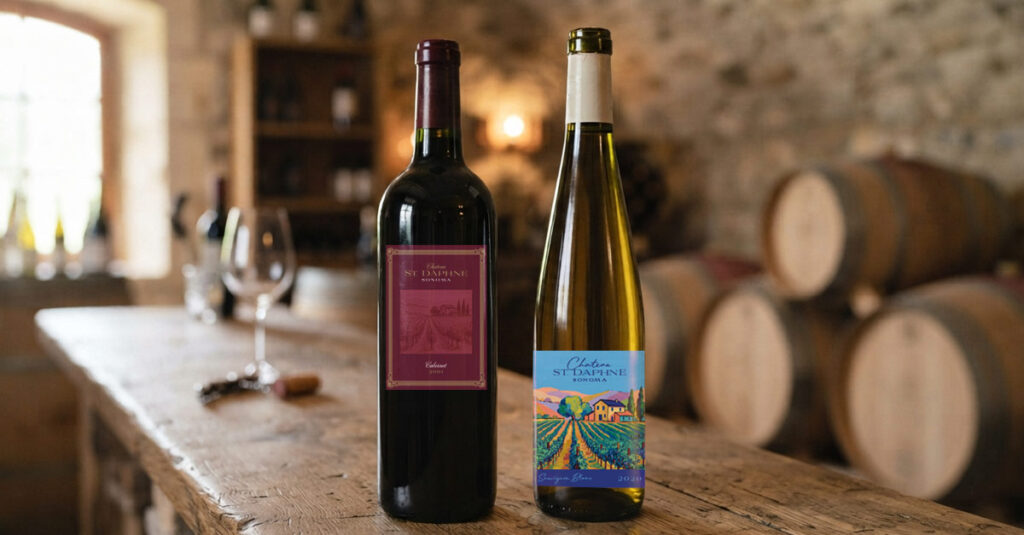
I know what I like in a wine. Not too dry, maybe a hint of fruit. But standing in the aisle at BevMo, I’m looking at a wall of bottles with no real way to know what I’m getting into. I can scan the label for tasting notes, but honestly those descriptors don’t mean much to me until it’s open and in my glass. So how do I choose?
I let my other senses take over. Something draws me in. The label, the bottle shape, the color of the glass. And if it’s a few dollars more than the one next to it but the bottle feels like something I’d want sitting on my counter after it’s empty, I’ll pay it. That’s packaging doing its job.
Wine is one of the most fascinating categories to watch as a designer because the signals are everywhere and the stakes are real. Box wine doesn’t need to taste bad for you to assume it will. The format made the decision before you took a sip. A screw cap is perfectly functional and many great wines use them, but there’s still a perception gap. The cork hasn’t been fully dethroned because packaging carries meaning beyond its physical purpose.
I never thought much about bottle shape until I started paying attention. Turns out there’s actually a functional origin story. The high shouldered straight bottle, known as the Bordeaux style, was originally designed to catch sediment when pouring. The softer sloped shoulder, the Burgundy style, came from a different winemaking tradition entirely. But today most wineries choose their bottle shape the same way they choose their label, what fits the vibe? A sleek straight bottle reads differently than a curved one, and winemakers know it.
And then there’s the label itself. Wine labels have changed dramatically. You still have the traditional approach, classic typography, old world cues that signal heritage and reliability. Then you have the minimalist modern approach, clean, approachable, no intimidation factor. And then you have the completely unexpected, illustrated characters, bold graphics, names like Panda Juice or No Fine Print. Those labels are making a personality statement. They’re saying something about who this wine is for before you’ve read a single tasting note. None of that has anything to do with what’s in the bottle. It has everything to do with whether you pick it up.
This is true across almost every consumer category. Shampoo. Skincare. Olive oil. When two products are functionally similar and you have no way to verify quality before purchase, design becomes the deciding factor. It’s not superficial. It’s the entire pitch.
I still have a mason jar from a boba place I visited once. The boba was expensive and honestly not that memorable. I never went back. But they served it in a heavy glass jar with a fitted lid and a wide straw hole, and if you brought it back on your next visit you got a discount. I kept the jar. I use it regularly. The product didn’t win me over but the packaging did its job so well it’s still sitting in my cabinet years later.
That’s the power of packaging. It creates value that outlasts the transaction. It influences decisions before a single word is read. It tells you who a product is for, what it’s worth, and whether it belongs in your life.
When you can’t taste before you buy, the bottle makes the case.
Make it a good one.