
While working with a design class on sweatshirts for a class trip, one student showed me a design with two-color bands wrapping around each sleeve, a two-color design on the front, and a different two-color design on the back. On paper, it looked great. But after years of designing for apparel, I could see that it would be cost-prohibitive and nearly impossible to execute cleanly.
The armbands alone would have required printing two colors on one side of each sleeve, then turning the sweatshirt over to print the other side while trying to align the bands exactly. That would have meant four screens, several print placements, and a high probability that the two sides would not meet cleanly.
A more practical solution would be to choose a garment with the two-tone sleeve treatment built into its construction, such as a baseball-style sweatshirt. The detail would be included in the cost of the garment instead of being added through multiple print placements, and the result would be much more reliable. The visual concept still worked. It just needed to be achieved through the garment rather than through screen printing. Recognizing that distinction requires an understanding of the medium.
Designing for a shirt still requires the same decisions about composition, color, and hierarchy as any other format. The difference is that the production process shapes those decisions. Color count, placement, fabric, and printing method all affect what can be produced and what it will cost.
Placement is one of the less obvious cost factors in screen printing. Each location requires the garment to be positioned and printed separately. As a result, a one-color design printed on both the front and back may cost more than a two-color design printed in a single location. Reducing the number of placements can sometimes leave room in the budget for additional ink colors.
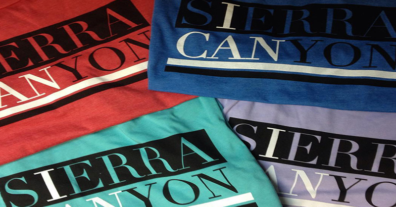
The color of the garment also affects the design. A black-and-white graphic printed on a red shirt can appear to contain three colors because the red fabric shows through, adding another color without requiring another screen.
That relationship can create problems when the same artwork is printed on several shirt colors. A soccer ball, for example, may be printed with black and white ink on a red shirt. Because the same screens are generally used across garment colors, the screen that prints white ink on a red shirt may print red ink on a white shirt. This would make the soccer ball black and red on the white shirt, which may not be what the client wants.
Placement and garment color are only two of the constraints involved. Fabric, printing method, level of detail, and order quantity can also change how the artwork needs to be built. An apparel design has to account for all of them to be produced as intended.
These considerations are not unique to apparel. Every medium has materials and production limits that affect the design. They are simply more visible on a shirt, where something that looks good on paper can still fail in production.